Excel Dashboard reports are the new buzz word employers are looking for, and for good reason.
They enable the reader to quickly make sense of the raw numbers by presenting them in visually rich charts and tables.
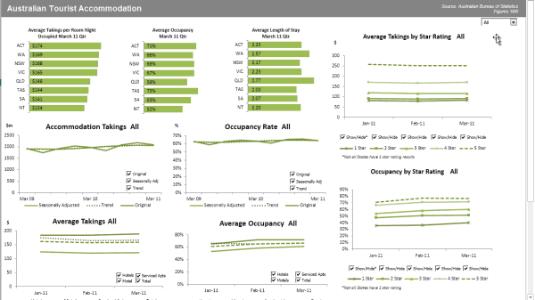
Dashboard Reporting Excel give valuable insights into the key performance indicators of the business, and perhaps most importantly; they’re interactive, which means the reader can filter and change views like this:

The good news is that creating Excel dashboard reports is easily done without the need for any other additional software.
Excel Dashboard reports are the new buzz word employers are looking for, and for good reason.
They enable the reader to quickly make sense of the raw numbers by presenting them in visually rich charts and tables.
Dashboard reports give valuable insights into the key performance indicators of the business, and perhaps most importantly; they’re interactive, which means the reader can filter and change views like this:
The good news is that creating Excel dashboard reports is easily done without the need for any other additional software.
And if you set them up right you’ll be able to update them each month without the need to do much more than paste or import your new raw data.
Step 1: Researching Your Dashboard
Your boss has asked you to put together a report and you’re thinking “I’m going to blow his socks off with an amazing interactive Excel Dashboard”.
But hold up, before you dive into Excel and start creating your charts. The first step is to do your research.
Boring, I hear you say. I know but I don’t want you to waste a load of time analyzing data and creating charts only to find out you should have sliced and diced the data in a different way.
Here’s what you need to know:
Find out the underlying reason for the dashboard request. Is there some hunch about business performance they want to prove/disprove?
Are there specific KPI’s they want to see.
Where will the data come from.
How often will it be updated.
Who will receive the report and in what format.
Step 2: Mock-up Your Excel Dashboard
Almost there, but before you fire up Excel grab a scrap of paper and mock up your dashboard layout. This is time spent well and will help you visualize the end result.
Step 3: Setting Up Your Excel Dashboard File
Ok, now you can click the Excel icon and start ‘em up.
Create 3 sheets in the file:
Raw data (you might need more than one of these)
Analysis (you might need more than one of these)
Dashboard
Bring in your raw data preferably by importing from Access or another system, or copy and paste it if you must.
Tip: Make sure your data is in a tabular format. That is; every record resides on one row with column labels for the different data groups like this:

This just makes it easier to use Excel formulas like SUMIFS, COUNTIFS etc. and other tools like Pivot Tables.
If you don’t have your data set up like this you’re just going to make things difficult for yourself in the long run.
Step 4: Analysing your Data
Get Your Tools Ready
Excel has loads of tools we can use to quickly analyse the data. Some of the key ones are:
Excel Formulas:
SUMPRODUCT, SUMIF, SUMIFS, AVERAGEIF, AVERAGEIFS, COUNTIF and COUNTIFS
COUNT, COUNTA, MIN, MAX, SMALL, LARGE, RANK
Database Functions like DSUM, DAVERAGE, DMAX etc.
VLOOKUP, HLOOKUP, INDEX and MATCH
IF, Nested IF’s, IFERROR, OR and AND
OFFSET, INDIRECT, CHOOSE
GETPIVOTDATA
Other tools you should have in your Excel toolbox are:
PivotTables
Excel Tables
Data Validation
Conditional Formatting
Form Controls
Shapes
Named Ranges
These are just bunch of the really important formulas and tools you should know. You can find free tutorials on these and more in my Excel Formulas list.
Start Crunching the Data
Now you’re ready to complete your analysis (on the analysis worksheet) by setting up a table of data to feed each chart or table in your dashboard.
You can use formulas and or Pivot Tables to extract the relevant data. Which you choose depends on how much data you’re working with.
If you’ve got a huge amount of data then fewer formulas mean less chance of things to go wrong, but it can also mean a slow file. You’ll have to test what works better for you.
If you have Excel 2010 or later you can use Slicers to control multiple Pivot Tables but they’re a bit big and chunky and can take up a lot of space on your dashboard.
If you use formulas then it’s a good idea to use named ranges or even better, format your raw data in an Excel table and make use of the Structured References.
Don’t forget to document your work. Yawn. I know it’s not much fun but if you set your file up how I’ve explained above you’ll make your job a whole lot easier. Plus using Named Ranges will account for half of your documentation.
Step 5: Building Your Excel Dashboard
So, you’ve done your analysis and now you’re ready to set up your dashboard and bring in your charts.
One of the key features of a Dashboard is the ability for the reader to interact with it. Allowing them to choose the time period, region and products etc. will provide them with the ability to get answers to their questions without you having to build another report.
So, how do you make it interactive?
You can do this in a number of ways, but one of the simplest is to use an Excel drop down list a.k.a. Data Validation List, that enables the reader to select the criteria they want to filter on.
Simply link your formulas to the data validation lists. When the reader makes a new selection the data displayed in the report dynamically updates.
Picture this:
You’ve got a data validation list in cell B2 that allows the reader to select the region:
You’ve then got a table feeding your chart containing your SUMIF formula which sums the data for the chosen region by referencing cell B2 in the ‘criteria’ argument:
=SUMIF(region_column, B2, your_sales_column)
As the reader chooses a different region from the list and whoosh, before your very eyes the charts update just like this:
If you’ve got your Excel tool belt equipped with the formulas and other tools I listed earlier then go ahead and start experimenting with some of your existing reports. See what improvements you can make so that they’re quicker to update and interactive for the reader. If you need help in Dashboard Reporting Excel
than you can meet our experts ask them for the help.
They enable the reader to quickly make sense of the raw numbers by presenting them in visually rich charts and tables.
Dashboard Reporting Excel give valuable insights into the key performance indicators of the business, and perhaps most importantly; they’re interactive, which means the reader can filter and change views like this:

The good news is that creating Excel dashboard reports is easily done without the need for any other additional software.
Excel Dashboard reports are the new buzz word employers are looking for, and for good reason.
They enable the reader to quickly make sense of the raw numbers by presenting them in visually rich charts and tables.
Dashboard reports give valuable insights into the key performance indicators of the business, and perhaps most importantly; they’re interactive, which means the reader can filter and change views like this:
The good news is that creating Excel dashboard reports is easily done without the need for any other additional software.
And if you set them up right you’ll be able to update them each month without the need to do much more than paste or import your new raw data.
Step 1: Researching Your Dashboard
Your boss has asked you to put together a report and you’re thinking “I’m going to blow his socks off with an amazing interactive Excel Dashboard”.
But hold up, before you dive into Excel and start creating your charts. The first step is to do your research.
Boring, I hear you say. I know but I don’t want you to waste a load of time analyzing data and creating charts only to find out you should have sliced and diced the data in a different way.
Here’s what you need to know:
Find out the underlying reason for the dashboard request. Is there some hunch about business performance they want to prove/disprove?
Are there specific KPI’s they want to see.
Where will the data come from.
How often will it be updated.
Who will receive the report and in what format.
Step 2: Mock-up Your Excel Dashboard
Almost there, but before you fire up Excel grab a scrap of paper and mock up your dashboard layout. This is time spent well and will help you visualize the end result.
Step 3: Setting Up Your Excel Dashboard File
Ok, now you can click the Excel icon and start ‘em up.
Create 3 sheets in the file:
Raw data (you might need more than one of these)
Analysis (you might need more than one of these)
Dashboard
Bring in your raw data preferably by importing from Access or another system, or copy and paste it if you must.
Tip: Make sure your data is in a tabular format. That is; every record resides on one row with column labels for the different data groups like this:

This just makes it easier to use Excel formulas like SUMIFS, COUNTIFS etc. and other tools like Pivot Tables.
If you don’t have your data set up like this you’re just going to make things difficult for yourself in the long run.
Step 4: Analysing your Data
Get Your Tools Ready
Excel has loads of tools we can use to quickly analyse the data. Some of the key ones are:
Excel Formulas:
SUMPRODUCT, SUMIF, SUMIFS, AVERAGEIF, AVERAGEIFS, COUNTIF and COUNTIFS
COUNT, COUNTA, MIN, MAX, SMALL, LARGE, RANK
Database Functions like DSUM, DAVERAGE, DMAX etc.
VLOOKUP, HLOOKUP, INDEX and MATCH
IF, Nested IF’s, IFERROR, OR and AND
OFFSET, INDIRECT, CHOOSE
GETPIVOTDATA
Other tools you should have in your Excel toolbox are:
PivotTables
Excel Tables
Data Validation
Conditional Formatting
Form Controls
Shapes
Named Ranges
These are just bunch of the really important formulas and tools you should know. You can find free tutorials on these and more in my Excel Formulas list.
Start Crunching the Data
Now you’re ready to complete your analysis (on the analysis worksheet) by setting up a table of data to feed each chart or table in your dashboard.
You can use formulas and or Pivot Tables to extract the relevant data. Which you choose depends on how much data you’re working with.
If you’ve got a huge amount of data then fewer formulas mean less chance of things to go wrong, but it can also mean a slow file. You’ll have to test what works better for you.
If you have Excel 2010 or later you can use Slicers to control multiple Pivot Tables but they’re a bit big and chunky and can take up a lot of space on your dashboard.
If you use formulas then it’s a good idea to use named ranges or even better, format your raw data in an Excel table and make use of the Structured References.
Don’t forget to document your work. Yawn. I know it’s not much fun but if you set your file up how I’ve explained above you’ll make your job a whole lot easier. Plus using Named Ranges will account for half of your documentation.
Step 5: Building Your Excel Dashboard
So, you’ve done your analysis and now you’re ready to set up your dashboard and bring in your charts.
One of the key features of a Dashboard is the ability for the reader to interact with it. Allowing them to choose the time period, region and products etc. will provide them with the ability to get answers to their questions without you having to build another report.
So, how do you make it interactive?
You can do this in a number of ways, but one of the simplest is to use an Excel drop down list a.k.a. Data Validation List, that enables the reader to select the criteria they want to filter on.
Simply link your formulas to the data validation lists. When the reader makes a new selection the data displayed in the report dynamically updates.
Picture this:
You’ve got a data validation list in cell B2 that allows the reader to select the region:
You’ve then got a table feeding your chart containing your SUMIF formula which sums the data for the chosen region by referencing cell B2 in the ‘criteria’ argument:
=SUMIF(region_column, B2, your_sales_column)
As the reader chooses a different region from the list and whoosh, before your very eyes the charts update just like this:

If you’ve got your Excel tool belt equipped with the formulas and other tools I listed earlier then go ahead and start experimenting with some of your existing reports. See what improvements you can make so that they’re quicker to update and interactive for the reader. If you need help in Dashboard Reporting Excel
| http://www.p2w2.com/excel-dashboard-reporting.php |
No comments:
Post a Comment